Explore colourful Georgian interiors of Harewood House
From pink and grey to vibrant yellow, Georgian interiors were awash with colour as a trip to Harewood House near Leeds reveals
Colourful Georgian interiors
If you think the interior colour palette of the 18th century was as muted as a Farrow & Ball catalogue, it’s time to think again, as a visit to Harewood House near Leeds, built between 1759 and 1771, makes clear.
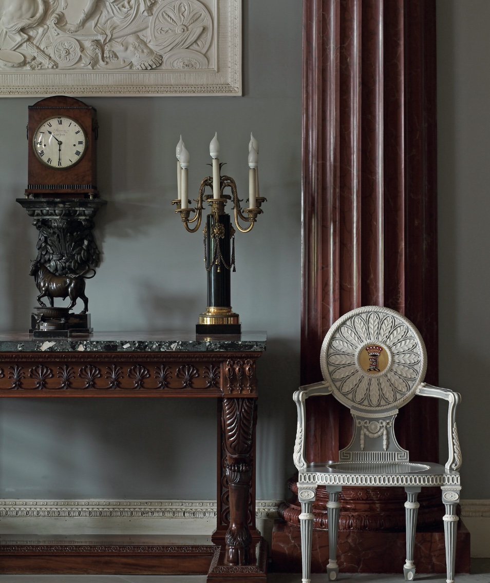
The trust’s curator and archivist, Rebecca Burton, said: “Harewood’s interiors were designed by the Scottish architect Robert Adam, famous for his signature neo-classical style. Like many other interior designers of the late-18th century he was not afraid to use bold colours, inspired in part by the rediscovery of the vibrant colour palette of the ancient world. Bright blues and greens, lilacs, pinks, terracotta-browns, and sometimes even black.”
Albeit some may now have faded. Rebecca continued: “Looking at colours of the 18th century is like looking through a faded lens because the colours are muted now, mainly due to light damage. At the time, everything was really bright, almost gaudy. This intensity has disappeared but in reality the colours were eye-popping and bright.”
As one might expect from the fashion-conscious Georgians, choosing the right colour for your home was vital, with price always a factor. Colours made from easy to obtain pigments were used to make inexpensive ‘common colours,’including stone, earthy yellows, lead grey and white. However, a more colourful palette needed more expensive pigments. These ‘fancy’ or ‘party’ colours, blossom and pea green, could be triple the cost of common colours.
In 1770, the architect William Chambers wrote to a friend: “With regard to the painting of your Parlours, if they are for Common Use, Stone Colour will last best and be cheepest, but if you mean them to be very neat, pea-green and white, Buff colur and white, Paris grey and white is the handsomest.”
Harewood’s Palladian roots
The start of George I’s reign in 1714 had seen the publication of two works which had a great impact on Georgian architecture and design: the first was the English edition of Palladio and the initial volumes of Vitruvius Britannicus. Both leant towards a classical approach to building design. But while the Palladian period, roughly 1700-1750, looked to the Renaissance for inspiration, neo- classicism looked directly to antiquity.
Harewood owner, the sugar merchant and enslaver Edwin Lascelles, commissioned the house in the Palladian style. But before long he had given way to Adam’s neo- classical fervour, which went on to include a gallery ceiling inspired by the ruins of Palmyra in Syria. Lascelles also commissioned Thomas Chippendale to make the furniture with Lancelot ‘Capability’ Brown charged with landscaping the gardens.
Unfussy hall
In terms of its colour palette, Palladianism turned away from the dark timber colours of the 17th century towards lighter interiors. A wealthy entrance hall was intended to showcase the majesty of the rest of the house. Harewood’s hall may have been decorated in light, stone colours during Adam’s day. It is now painted in colours partly inspired by the Regency redecoration of the room.
There would have been no ‘stuffs’ (no curtains or upholstery) as they could harbour germs. Instead a polished hall chair with its decorative arms would declare the lineage of the owner. Even today the communal spaces of grand buildings are often painted in pale colours alongside statues.
Pretty in pink
As Palladianism gave way to neo-classicism in the 1760s the bold use of colour within the home, and at Harewood, became more popular.
One of the crazes was for pink, a shade particularly popular in France where it was a symbol of power, novelty and luxury.
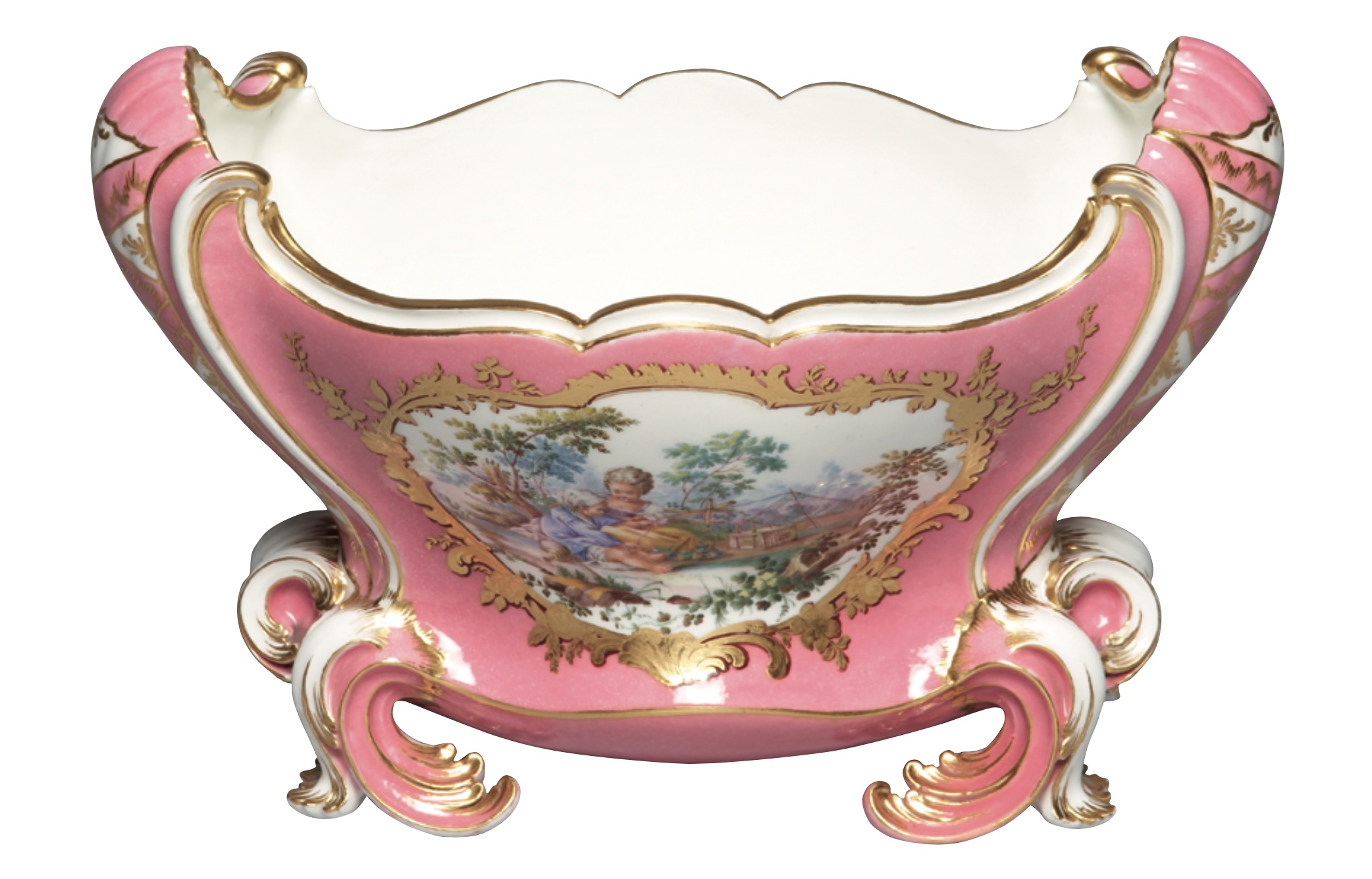
The sugary-pink cuvette Mahon flower vase (above), part of the Harewood collection, was made by the Sèvres porcelain factory. Patronised by the French royal family, Sèvres was known for producing the most exquisite and innovative wares, designed to appeal to and entice the fickle and fashion-hungry French court.
One of Sèvres’ selling points was the development of a unique colour palette, invented by pioneering artists and chemists employed by the factory. It was known for its brilliant ground colours (couleurs de fond). These are the solid or monochrome background colours tinted with metallic oxides. One of those colours was ‘fond rose,’ a strong pink, which achieved huge popularity with the French royal court (and beyond) and over time became associated with Madame de Pompadour (hence the term ‘rose pompadour’ or ‘Pompadour Pink’).
Indeed, Louis XV preferred the colour more than his mistress did, purchasing 77 rose-ground pieces (the majority of which were decorated with masculine hunting scenes).
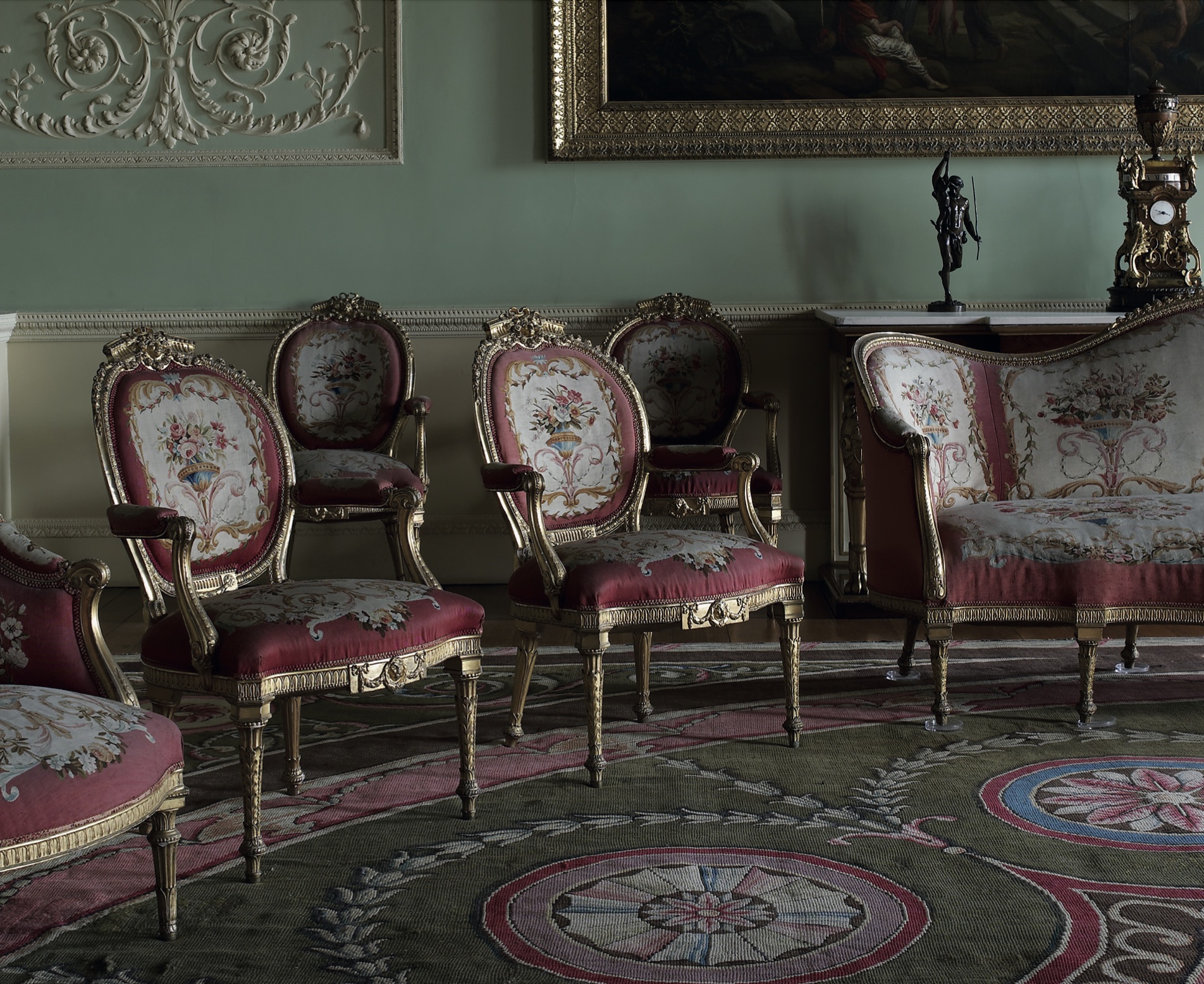
Music Room at Harewood House
Adam’s bright colour palette was also inspired in part by the rediscovery of the vibrant colour palette of the ancient world. He was particlarly fond of pink and green together.
In Robert and his brother James Adam’s Works in Architecture, which first appeared in 1773, Robert writes: “Light tints of pink and green, so as to take the glare off the white, so common in every ceiling and side walls with their hangings, pictures and other decorations.”
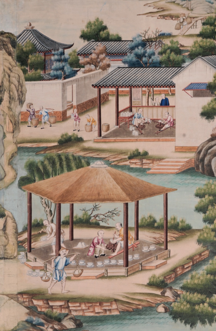
The combination is best seen at Harewood in the Music Room. Here a flat plaster ceiling decorated with low-relief arabesques and geometric motifs incorporates small round classical paintings thought to be by Angelica Kauffman; these medallions are exactly reflected in the Axminster carpet below, harmonising with the pink and green decorative scheme.
Even the other furnishings incorporate elements of the same motifs: the Chippendale tables repeat the bellflower swags of ceiling and carpet, and the geometric curved inlay echoes the circles and lines of the plaster mouldings.
This room is one of the most ‘complete’ Adam interiors within the house (many others having been modified by Sir Charles Barry in the 19th century).
Celadon green in Georgian interiors
Throughout the house Adam introduced intricate and subtly contrasting areas of colour into wall and ceiling decoration with pale green one of his default colours.
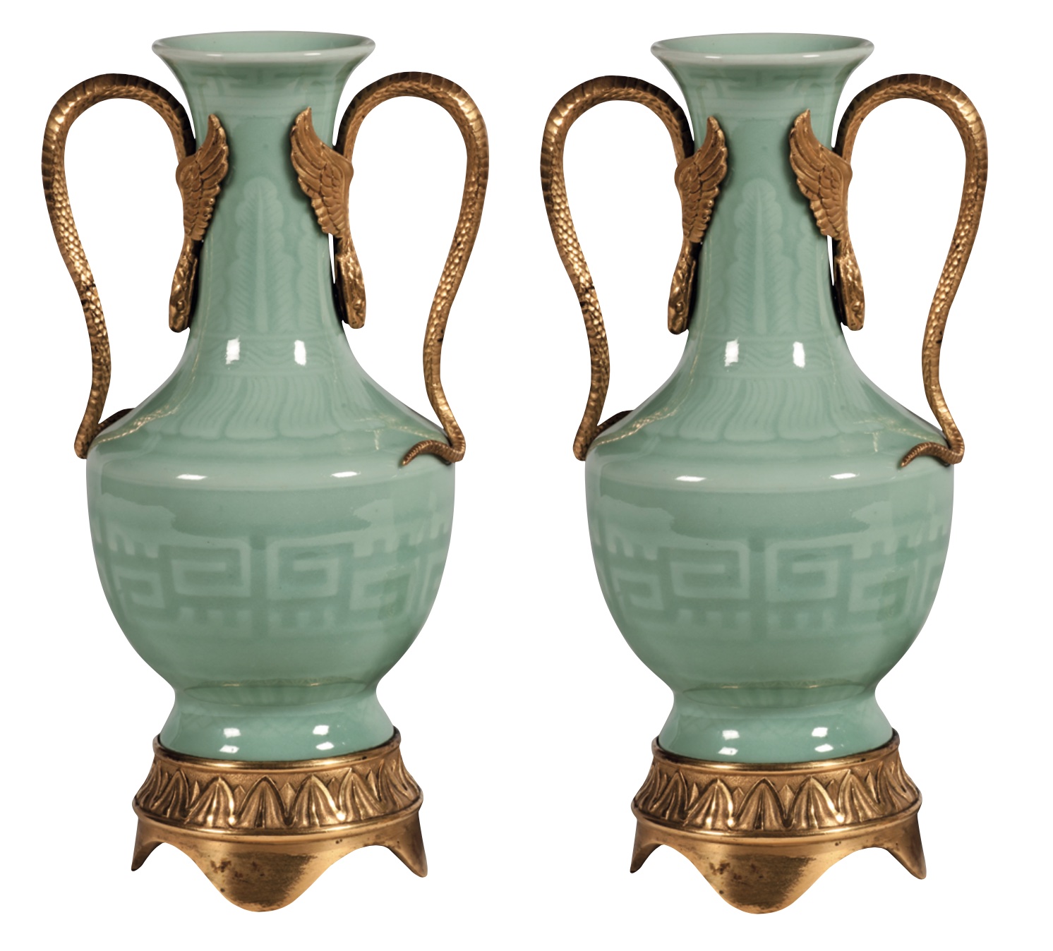
Green is another colour seen not just in Harewood’s interiors but in its porcelain. Chinese porcelain has been highly prized by European collectors since it was first traded in Europe in the early 1500s. Harewood’s collection was acquired by Edward ‘Beau’ Lascelles in the late 18th century. Many of his pieces are decorated with gilt-bronze mounts that were added in France and England to appeal to the European taste for gilded decoration.
China’s celadons are the world’s oldest style of high-fired glaze. They emerged in China’s Bronze Age when white-hot wood ash in the kiln fused onto the wares’ surfaces. Their distinctive grey-green colours derive from iron oxides in both ashes and clays.
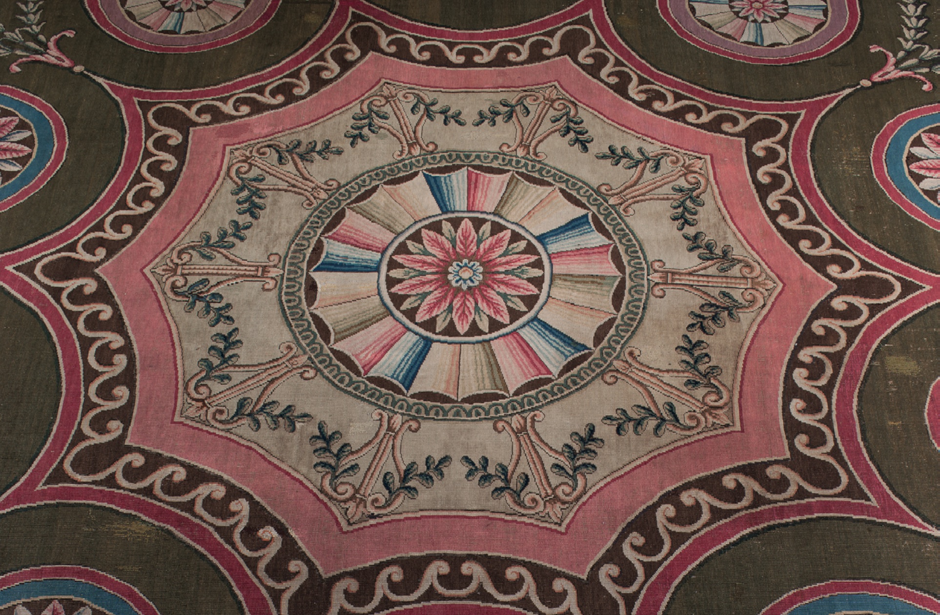
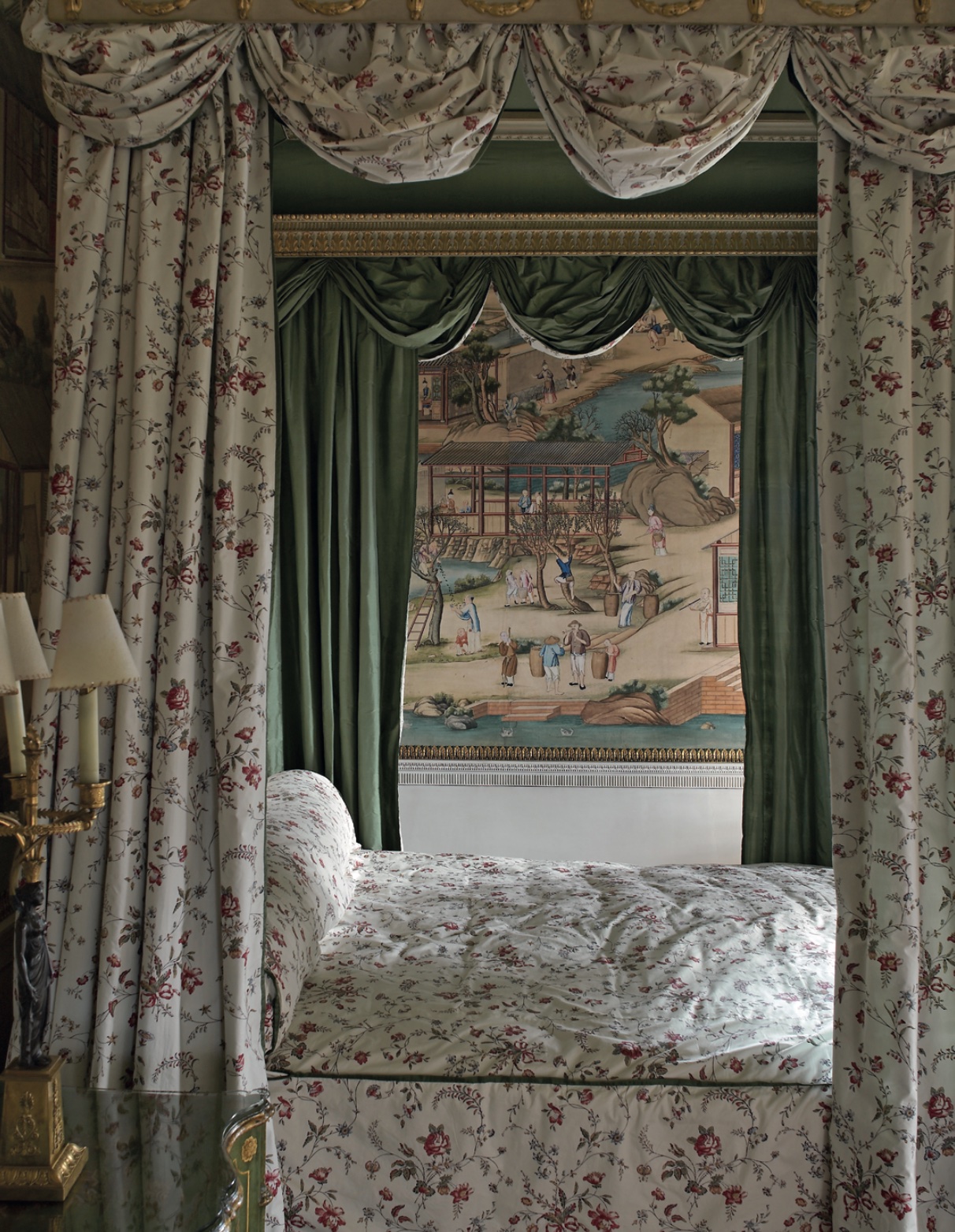
Chinese goods were highly fashionable in Europe in the 18th century and some of the bedrooms at Harewood were hung with hand-painted Chinese wallpapers imported via the East India Company.
Paper conservator Allyson McDermott, said: “The 18th-century Chinese pigments were made from semi- precious stones including azurite (blue) and malachite (green) giving a depth of colour unfaded by time. There are also rare organic purples, deep crimson reds made from crushed cochineal beetles and whites from the shells of oysters.
Bold yellow
Of all the primary colours, yellow is the one that seems least used by the Georgians (apart from at Harewood). One reason may have been the jarring effect it had on the gilt frames of the paintings which hung against it which was said to kill the picture.
In one famous outburst from Mrs Arbuthnot, writing about the Duke of Wellington’s plans for the Waterloo Gallery at Apsley House, she wrote: “He is going to hang it with yellow damask, which is just the very worst colour he can have for pictures and will kill the effect of the gilding. However he will have to have it.”
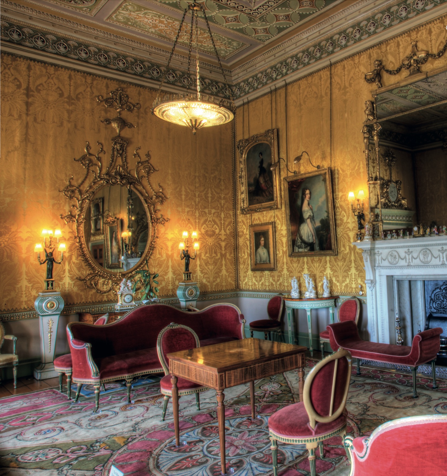
Another homeowner determined on the same scheme was Harewood’s Edwin Lascelles who purchased yellow silks for Drawing Room walls. One reason may be the colour, like the more expensive bright blues, greens and reds, it signalled rarity and richness. Yellow was also the colour of the Chinese emperor becoming a symbol of power in the Western world too.
The use of yellow was most likely to the frustration of Adam, who had originally envisaged another pink and green scheme for the room, like the Music Room, evident from the mismatched pink and green colour palette of the original Axminster carpet (which had clearly been put into production before this last-minute change of plan).
Chippendale commission
Chippendale responded to the change of plan with enthusiasm and designed the seat furniture (originally yellow not red) to correspond to the new colour scheme.
He supplied 10 cabriole chairs without arms at £4, 4s each, as well as two bergéres and two sofas. The bill describes the chairs as “10 Cabriole chairs without Arms richly Carved neatly Japann’d yellow and white varnished, stuft and Covered with your Damask and finished with gilt Nails £44 ”, which implies that Edwin Lascelles provided the silk damask for the whole suite, as well as for the walls and curtains.
Not only would each seat have been painted white and yellow and upholstered with yellow damask, but each piece was also topped off with a carved sunflower positioned on its top rail. Now painted green, it would have originally been in matching yellow.
Rebecca Burton continued: “There’s something wonderfully poetic about Chippendale’s level of attention to detail, combining colour and carved motif.”
This article originally appeared in the May 2024 issue of Antique Collecting magazine. Plan your visit to Harewood House at www.harewood.org


